Jeff Dellow 1949 - 2024
Jeff Dellow, who died in December 2024, was quietly one of the most interesting British painters working with the legacy of abstraction in Britain. I first met Dellow in a cold studio in Deptford in late 2015; I had the opportunity to interview him, and work closely with him to exhibit his paintings on several occasions. I was excited about his work as they seemed to have a growing momentum that seemed to me at the time to offer the viewer intelligent visual spaces that flowed between ordered and improvised arrangements.
In the many discussions, I found that he was analytical and critical about his creations, but he also retained the free pursuit of more intuitive and instinctive approaches to the creation of touch, form and space. I wrote at the time about paintings like August Prospect as bustling encounters of colour, line and shape that drew you in and out of their surface; stacked painted lines jostle and disappear underneath hard-edges, and areas that seem to fall away into other painted voids. Abstract shapes were delicately cultivated, and sat alongside spaces of fresh vivid colour and sharp blacks and whites. These black areas were then softened by a layer of oyster white, which seemed to calm the black. The paintings contain atmospheric transparency; an optical balance of fact and implied fiction that seemed to allow glimpses beyond the surface.
I was also fascinated by how Dellow organised his studio in a way that offered him a challenging and imaginative environment within which to stimulate the discovery of new possibilities and to guard against the possibility of falling into a simple formula. At times when entering his studio you would be confronted by a wall covered in small panel paintings organised in a grid system . He would paint and place these panels on the studio wall, occasionally moving them around to examine relationships between the works. Placed together they act as a catalyst for the cross-fertilisation of ideas between paintings, individually the panels allow great contrasts of scale and touch.
Below is a short interview that was included in a catalogue that I created with Dellow for the exhibition Visual Stream: Recent Paintings by Jeff Dellow in 2018. His family are holding a memorial exhibition Jeff Dellow 1949-2024 at APT Gallery in Deptford, London between the 26th and 29th of June 2025.

August Prospect, 2012, Acrylic on canvas, 79cm x 96cm
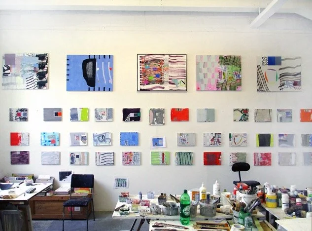
Jeff Dellow’s studio at Art in Perpetuity Trust, London
Matthew Macaulay (MM): When do you remember first finding abstraction persuasive?
Jeff Dellow (JD): The first thing that had an effect on my selection of the genre, was the Art of the Real show at the Tate Britain in either 1968 or 1969; It was followed up by a lot of shows about pop art. The whole direction of contemporary painting seemed to be largely American influenced, there seemed to be a two-direction choice, a forking in the road, the first being either visually figurative or to do with advertising, and the second being to do with the Art of the Real. I thought the Art of the Real had a more persuasive effect.
MM: So why was this?
JD: Just by comparison of the two, it seemed more persuasive, it had far more depth of thinking, than the contemporary culture aspect. The Art of the Real felt deeper, longer and more profound. I think other shows that substantiated that feeling happened for some time.
MM: I wondered what magazines would you be reading during this time?
JD: Art in America, Studio International… and when I was on my degree course at Maidstone College of Art I followed these things every week. I tried each month to read every magazine.
MM: Did the articles themselves seem important?
JD: They did, there was also a kind of openness in the articles. The articles where good, but the art also backed up the idea of method and constructive possibilities among materials. Following the Art of the Real in the late sixties it was more like minimalism, minimalist art was a lot more compelling. There were several people at the college that I went to that were working in that genre already, so that was exciting.
MM: This show happened whilst you were studying at St Martins College of Art, what was it like there when you were on your foundation year?
JD: Well in St Martins you had the whole sculpture ethos, and that was interesting. The painting being produced was much more over towards the second choice, or my second choice, which was more towards popular culture and pop art. There were only a few people dealing with abstraction, when one walked around the studios you could see some were, but the influence of British pop art was strongly represented.
MM: What kind of work did you make after this foundation.
JD: Well it was likely Frank Stella that led the way, after his monochromes, I started pictures of sort of grids with coloured pencils, I then scaled up to an air brush. I started making pictures that generally had a rotational system, just free drawn rotational system usually 45 degrees on invisible grids on canvases that where 6ft tall by maybe 8ft or 10ft across, where the divisions were narrow panels with rotational bands of colour. These would form a field, a kind of rotational field. A lot of these paintings relied on drawing a directional system, a freely drawn order. This led me on to constructing a kind of vat of paint that would hold about two gallons, that was lined with waterproofing. I would align these panels of canvas and dip them in colour of thinned down acrylic. At this time manufactures were making acrylic aping the viscosity of oil paint, so you actually had to thin it all down and get this volume of paint. Before I went to art college I worked in a chemical company that made acrylic paint.
MM: So, this is Rohm and Hass, when did you work there?
JD: Yes, from leaving school from about 1963 or 1964, before going to art college in 1968. It was top quality acrylic paint; it was more like the paint that the Americans were talking about, this kind of thinned down deeply saturated colour, with an acrylic binder.
MM: Who were these Americans talking about paint?
JD: Helen Frankenthaler, Morris Louis, Kenneth Noland and all those people who were using un-primed canvas, and using those attitudes that would assist the flow of the paint. All of that was something I was familiar with prior to going to art school, particularly working in the Labs at Rohm and Hass. The paint production there was all around me, there were physically huge vats of paint.
MM: You spent some time in Africa in 1990 was this a profound experience? Do you think it left an impression on your work?
JD: Yes, it was extremely exotic, it was in Zimbabwe and the first time I had been on the continent of Africa. It was one of those experiences that was both humbling and inspirational. I think there was already a fascination with nature, but when you get immersed in a place it is radically different. There were also other practical things such as that you could not get planed three by one timber, some people would say that you could find the wood you need in the surrounding area and get it cut at a saw mill. When I got there, there was only some materials available, they were mainly acrylic paints, petty weird acrylic paints at that. The other thing that was available was the sort of material that beer matts are made off, they had big rolls of it, it was a kind of six-foot-wide roll of durable card.
MM: The visit to Africa was to attend an artists’ workshop, what did they get you to do here?
JD: You started in the morning, and you did what you wanted to do. It was very inspirational that the sculptors started at six am and stopped at six pm, this was because it got light at six am and dark at six pm, I mean total darkness, no street lights. It was self-resourced, the things I responded to where the things that were there; the kind of insects and the way they divided the land with stones, staging things out. The colour was surprising, because the light quality was almost overhead sunlight, that kind of blanked out colour, so sharp contrasting that it heightened light and dark. Whilst there I was asking a chap who was a practicing ceramicist, and he pointed out key things about where he could get his colour in the earth for his glazes; he was digging this up. We went on a walk and he showed me a lot of things, he talked about typical trees and these igneous granite blocks that looked rather like Henry Moores sculptures. Quite bizarre really. It got me to thinking fantastic greys, green lichens and earth rich reds. Then the colours of insects and predators, they had colours like black, white and yellow; there were bees as big as golf balls.
